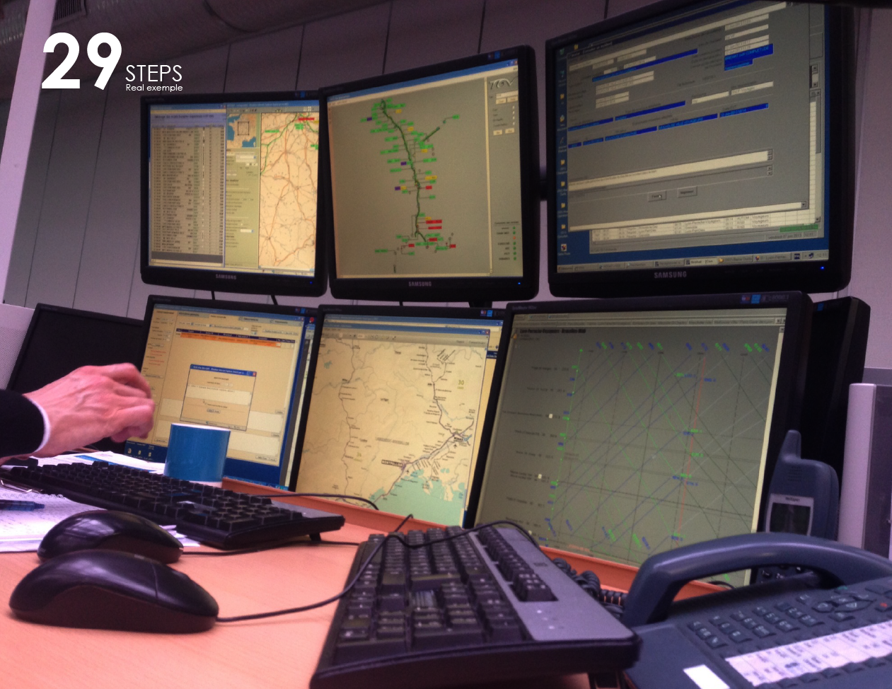
The SNCF is the french national train company but they needed a large re-organisation. Different teams, different organisation, different tools. 5 command center organize the train circulation for 5 districts but they don’t share the same methods. Every district coordinator is overload with small event so big crisis are a mess. 10 min before the first head-up. Communications between trains, command centers and stations are engaging a far too long delay. Information loop is uncertain. There is no certain and immediate feed back coming up the command center. Too much tool for uncertain informations. Command team are using more than 300 software, they use different software to check informations.

I was there from the start. Starting from the search field until the testing sessions. I work with many teams from the product owners and the IT teams I helped redesign the information flow and write specifications. Then during 2 years we transform the IT from the backend database until the front end applications. As the lead designer I help reorganize the workstation and the applications.


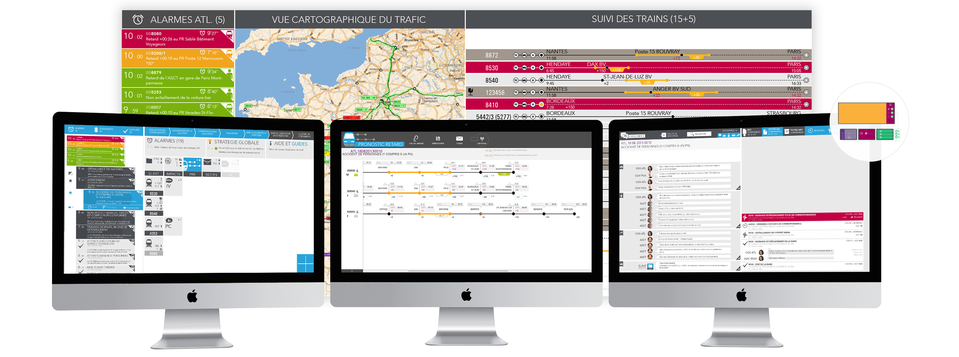
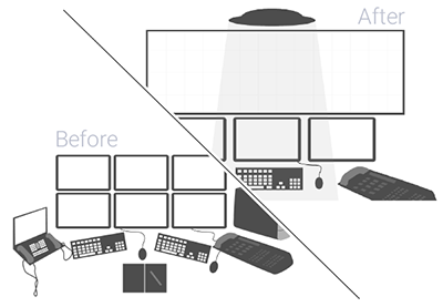
We transform the workstations of team in the command center. Passing from 6-7 screens on 2 computers per person to 3 screens in order to coordinate the loop in the treatment of informations. left : event and alert incoming middle : work the events and engage actions right : follow up the ground actions until the resolutions of events. The command center are now first-of-the kind industrialize, no fussy situations anymore. The process are known and shared. Resolution even for hard crisis a multi-step process down from the train drivers and the stations until the end users.
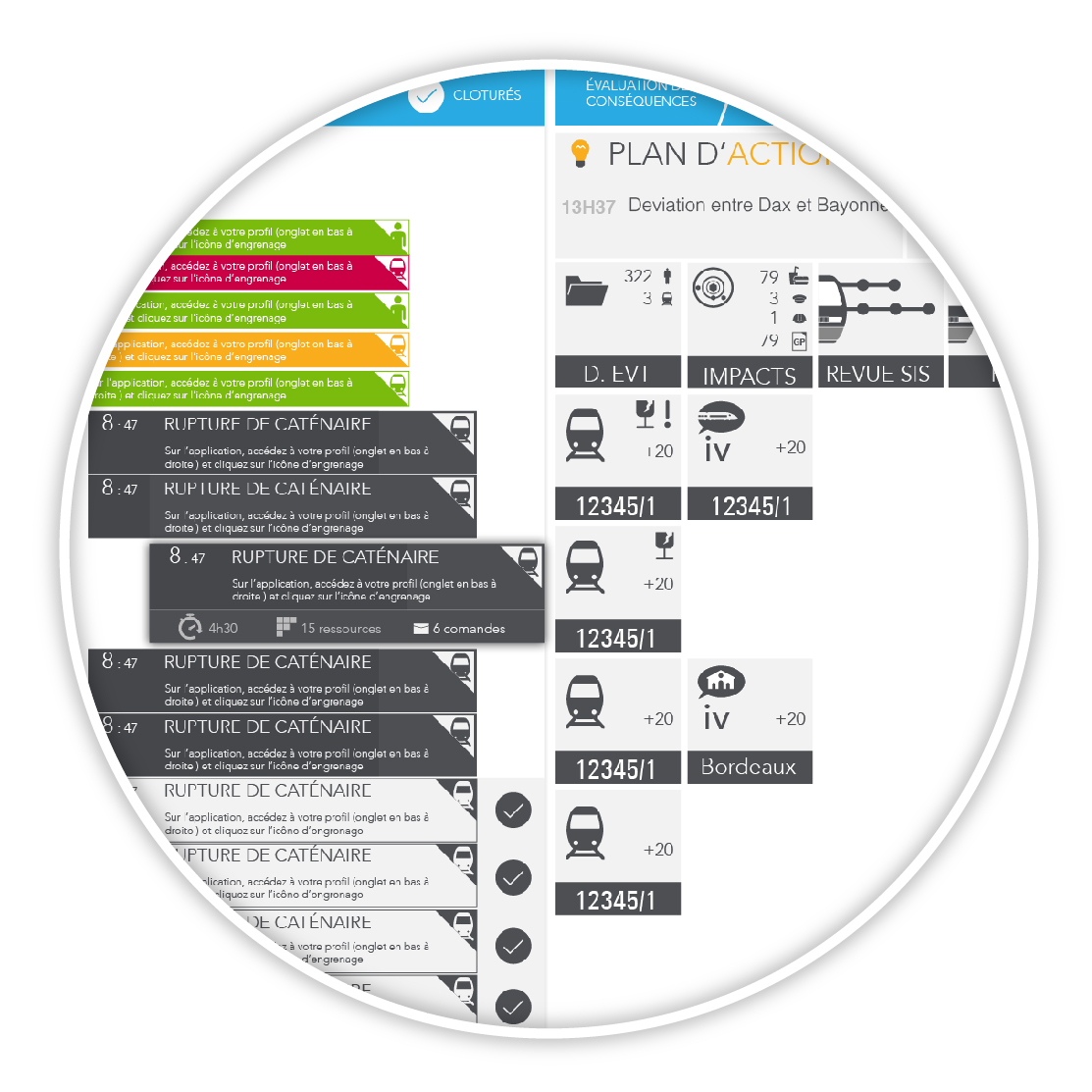
Following the sprints of IT transformation we replace the applications. In replacement of 4 applications making similar actions we create a new one with consolidate information. Using the UI to win time Starting common guidelines for all applications we used a similar design strategy as atomic. As for consequences all designer used the same atoms, molecules and so on. We needed to go further with interactions between each screens so I proposed the use of chromium to facilitate interactions between each module. After the technical check up it was accepted so could tailor interactions and feedback between each module.

I am proud to say incidents informations are now flowing in real time. Even better we anticipate transport delay for final clients. Let’s say an accident occur on the railway. The end-users will receive a message before they leave home that their train has 15 min delay and explain why.
