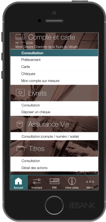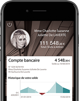
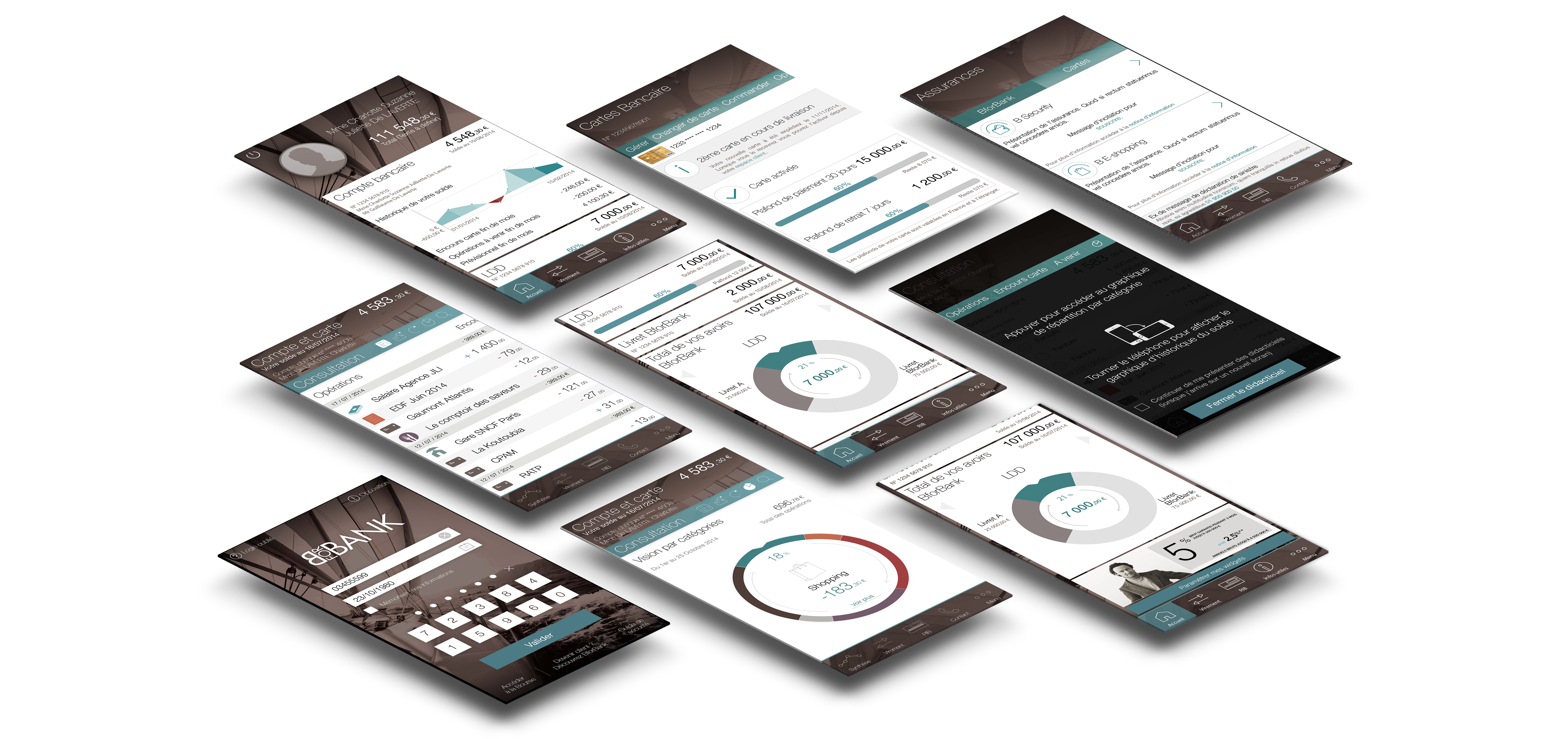
B for Bank was a saving bank for high-fliers but since 2016 they open checking account for large scale public.
That was the opportunity for a new native app for Android and iOS.
On top of that they had the worst app off all store so getting back the trust of their users was a strategic issue.
The pin point : users need to be in control of their money !
The consequences for the experience are about the details for each informations and the empowerment of the users.

These app are a part of a larger strategy as the first and main contact for users. As a sensible project we had restrain user ressources until the final stages, so we focus on co-design workshop at the beginning until we could use beta users. We established a strategy based on the benchmark and the personae to work on the empowerment of the users. Then using the lean design (build measure learn) to adjust it along the sprint until the market release.

Situation point

Personae

Backlog functionality
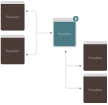
User story

Wireframes

Look and feel

Interaction grammar

Beta user

Build Mesure Learn

Market release
Empower users This has the consequence of numerous functionality and navigations hierarchies. I embrace the strong brand history and we re-wright the graphic rules in order to adapt the look and feel for mobility. Using a interactions and UI to get out the usual getting above Android and iOS preconisations. On top of that every user story could get done in less than 3 minutes and never been block because of the network.
