Transforming the backlog in a comprehensive UI

This project was the first one of a larger trajectory of rail circulation management evolutions. It will decide witch company can work for the national french rail company for years to come on the design of new workflow and tool for circulation monitoring. My role as the funder designer of this great adventure was to prove that design is strategic. By this I mean stop using « design » as a decoration level but from the early stage of every services to give a vision to share and adjust the projection. We also had to prove to the client (SNCF) that my company capacity (well at this time only me…) was able to realize all their software design.

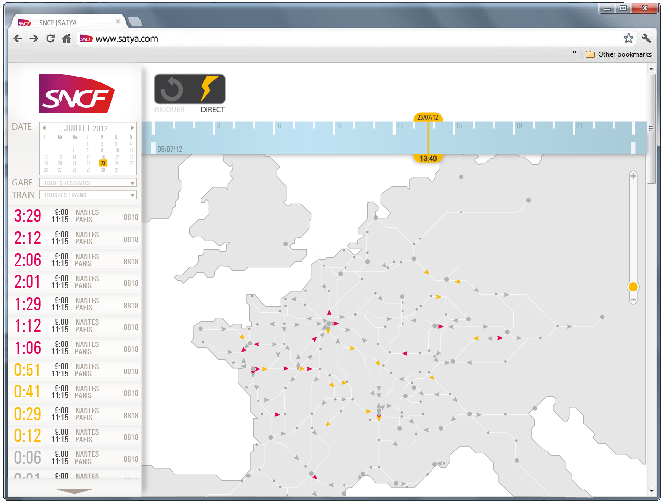
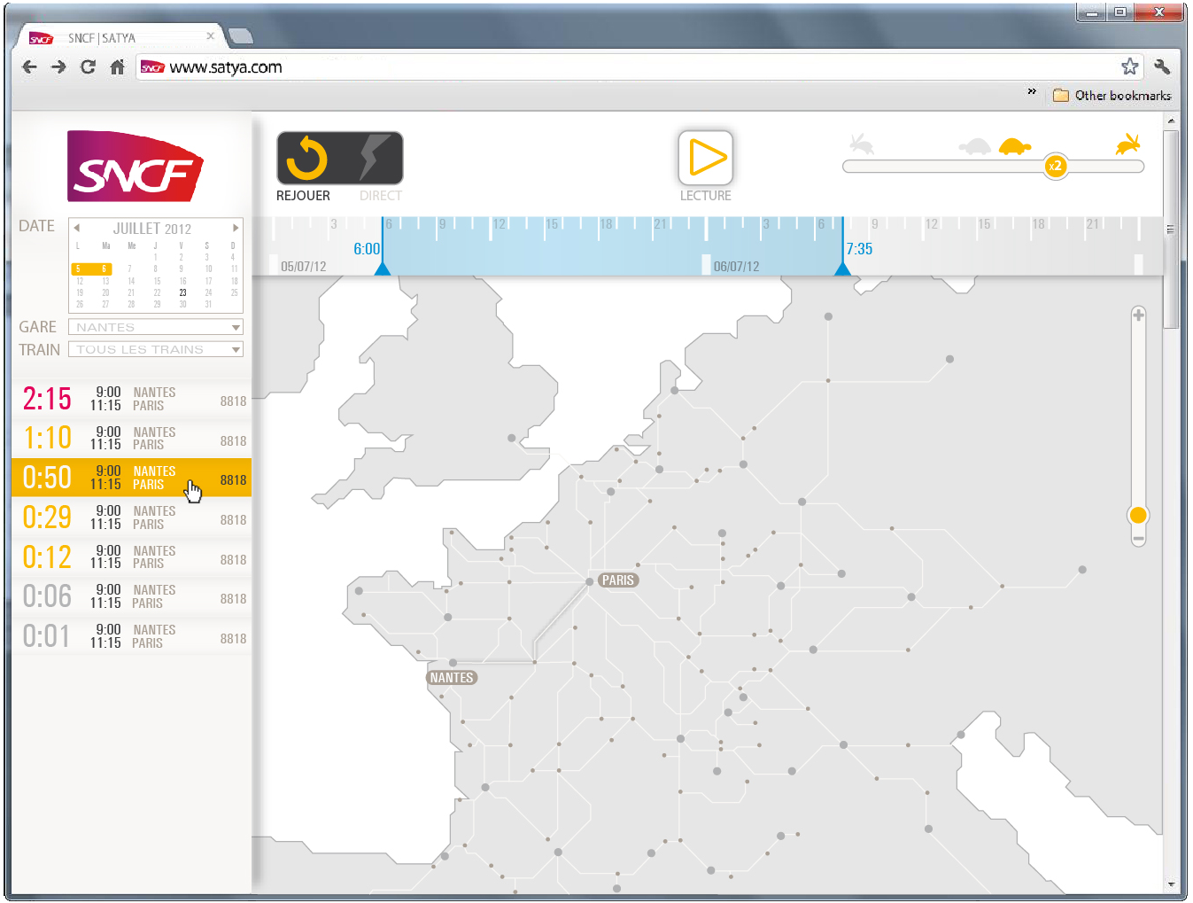
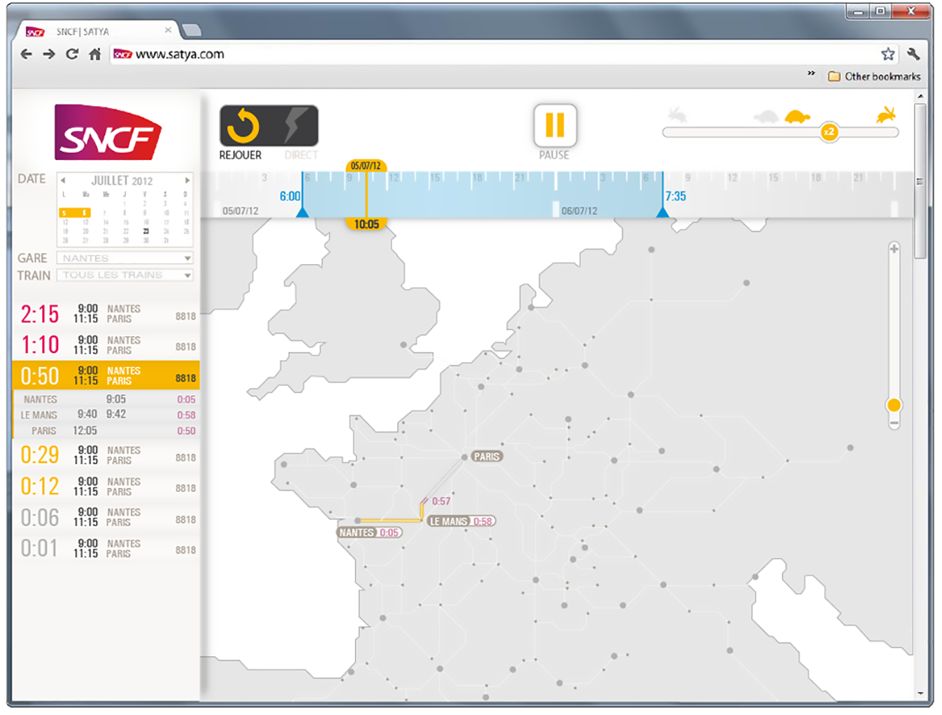
It will be used on desktop in a browser from the command room to watch and monitor in real time the train circulation. It will also be used as a class support to learn new strategies of resolution of circulation jam with the replay option. User may follow a train, a station, a district or having a global overview.

We worked from the theoric transportation plan by comparaison and also from a large number of data input. The aim is to render a NATURAL live representation of the train traffic of France. Also we should help user making quick decisions so we couldn’t be too figurative but schematic enough to help user focusing on jam resolution and anticipation. I developed an interface based on geographic représentation and focus my attention on 2 points : affordance and color meaning.

This was a rush design project (4days) with simple user needs. I didn’t follow up on this one nether the less it was for my company a way to win the larger trajectory project where I was in position to follow up. It was for me a way to help my client thinking design as a strategic tool that I will help to put in motion for the rest of the SNCF circulation services.